Featured Image by Edho Pratama on Unsplash
The final assignment for Technical Writing class is to create a website. I decided to design a website for myself, as an imagined author. Here are some of the main points I focused on:
Usability & Accessibility
I wanted to make my website user friendly. In previous posts, we’ve discussed how the average online reader will scan a block of text, rather than read it.
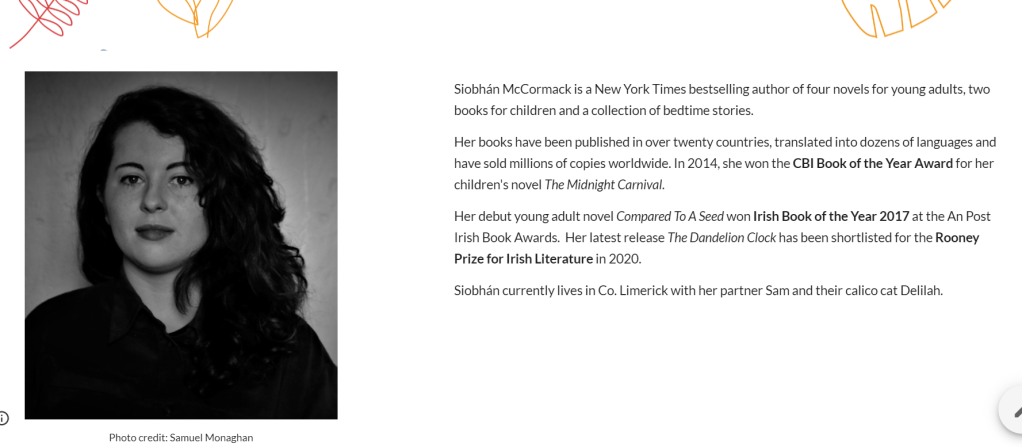
The About page is the most text heavy, so I chose to include an author’s photo to balance out the text, using white space to enhance readability.
To ensure usability and accessibility for all users, I added Alt Text to all images, which describes pictures for those unable to view them.
aesthetic
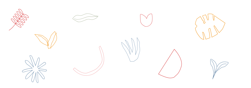
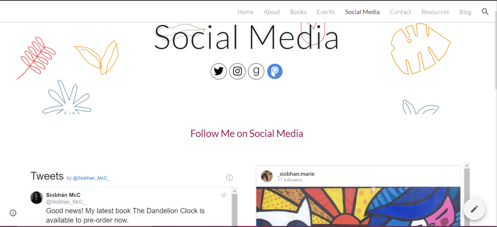
I created all images in Canva. For my header, I chose elements listed under the ‘Simple Drawn Objects’ category, incorporating a handmade feel to the design. These images reminded me of doodles I would draw as a teenager. This reflects the audience I write for – children and young adults.
I chose a minimalist theme with pastel colours, to give a modern and fresh quality to the design. I used a sans serif font, with a large, bold, purple typeface for headings and line breaks to facilitate scanning.
For my books, I chose bright colours contrasting with the white background of the website, to ensure each image stood out.

Navigation
The main menu is located on the top right corner of each page, allowing the user to navigate to any part of the website from the page that they are on. All social media icons are linked to my accounts and the book covers are linked to online stores where you can purchase them.
So that’s it from me. Do you have any other tips and tricks on making a good website? Feel free to take a look at my website and let me know what you think in the comments!
